Organic Planet
Organic Planet is a product website showcasing high quality organic products. Each products highlighting its origin, natural ingredients and wellness benefits to support healthy and sustainable lifestyle.
PROJECT TYPE
Website development
TIMELINE
2 Weeks
UI/UX Design
.png)
How it started?
The project began with the need to create a visually appealing and intuitive product page. The challenge was to highlight the organic and natural quality of the products while making the browsing experience simple and engaging for users.
Project overview & My role
TEAM
Design & Development
DURATION
2 weeks
MY ROLE
UI/UX Designer
TOOLS
Figma
Pen and Paper
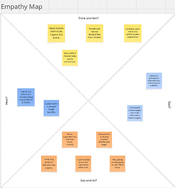
Research & Analysis
-
Identified target users: health-conscious individuals seeking organic products.
-
Analyzed competitor websites to understand best practices for product pages.
-
Highlighted user priorities: clean product images, benefits, ingredients, and easy purchase flow.
-
Noted pain points: cluttered layouts, overwhelming information, and confusing navigation.
-
Insights guided design choices: clean layout, visual hierarchy, readable typography, and trust-building visuals.

Key Insights
Users associate visual simplicity and clarity with authenticity.
Design should communicate trust, purity, and wellness through minimal layout, earthy tones and clear product storytelling.
Define
After gathering insights from research and user observations, the Define Phase focused on identifying key user needs and design goals for Organic Planet. The aim was to create a product website that communicates the brand's organic values, product purity, and trust through simple, visually appealing layout.
Problem Statement
Users interested in organic products often find it difficult to understand product authenticity and benefits due to cluttered design and lack of clear information.
User Needs
-
Quick understanding of the product origin and quality.
-
Visually clean presentation of wellness benefits.
-
Easy browsing of organic products
Goal
To design a minimal and informative product page that build brand trust, highlights natural ingredients, and offers an intuitive browsing experience- even without complex e-commerce features.
Solution
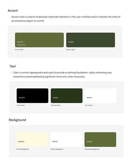
Designed clean, intuitive product pages that highlight images, key benefits, and product details. Used visual hierarchy, earthy colors, readable topography, and clear CTAs to improve usability and build trust. Collaborated with developers to ensure responsive and accurate implementation across devices.


Given the product details design
The product image on the left draws attention, while concise points on the right communicate purity, quality and health benefits.
Sketches & Wireframes
Created low-fidelity sketches and wireframes to plan layout, hierarchy, and user flow for product pages, ensuring clear product presentation and intuitive interaction.


.png)
.png)
Design System
.png)

User testing
Conducted usability testing on high-fidelity prototypes to evaluate product page clarity, navigation and overall usability. Key testing elements included:
-
Task Completion: Users where asked to find product details, add items to cart, and explore related products.
-
Time on Task: Measured how quickly users could locate key information.
-
Error Tracking: Noted points of confusion or misclicks during interaction.
-
Feedback collection: Gathered qualitative insights on layout, readability, and trust in product presentation.
-
Iterative Improvement: Used findings to refine visual hierarchy, CTA placement, and information layout for better usability.
Key Takeaways
-
A user-centered approach led to clear, visually engaging product pages.
-
Importance of visual hierarchy and trust building design in e-commerce.
-
Collaboration with developers improved design-to-development alignment.
-
Iterative testing refined usability and enhanced overall experience.
Looking Ahead
Currently, users can browse products but cannot complete purchases. Future plans include integrating a shopping and checkout feature to enable online buying, along with personalized recommendations, customer reviews, and enhanced mobile shopping optimization. Continuous testing will ensure a smooth trustworthy shopping experience aligned with Organic Planet's values.
.png)
